Sales Visualization with Forecast Trends
2 min read
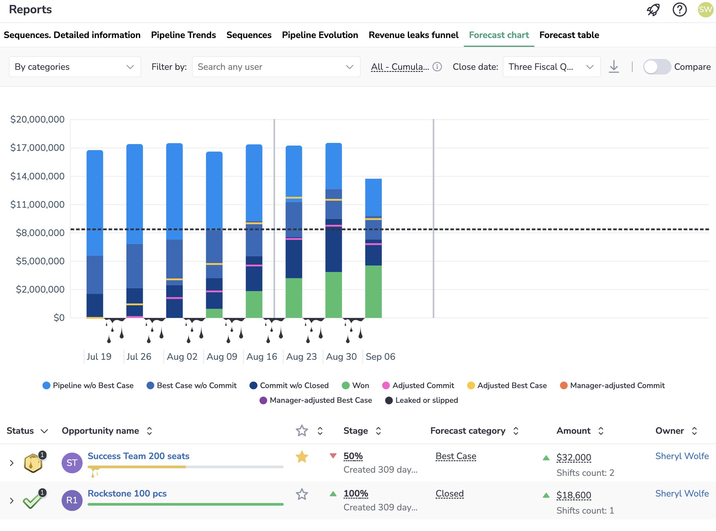
The Forecast Trends chart visualizes your company’s sales process over the specified period.
Using this chart, you can track the performance of individual Sales Reps, specific sales team, and whole company.
Select what Opportunities to display
Before reviewing your team’s Opportunities and how they’re going, make sure that you will see exactly the deals you want to see by specifying the period, forecast type and other filters.
Specify the period
 Start by selecting the Period for which you want to see the Opportunities. You can do it by selecting the necessary period in the Close date drop-down list.
Revenue Grid saves your choice and the next time you open this page you won’t need to configure the selection again, you can just continue where you left.
Select forecast type to display the Opportunities
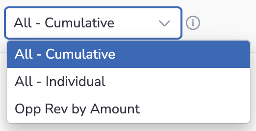 If your company uses Forecast types, select any of them in the drop-down list next to the Close date field. You will only see the Opportunities that belong to the selected forecast type.
By default, Opportunities from all forecast types are displayed on this page (All - Cumulative), but you can select any Opportunity-based forecast type in the upper-right part of this page.
Learn about setting up forecast types in Salesforce…
Filter to narrow down the list
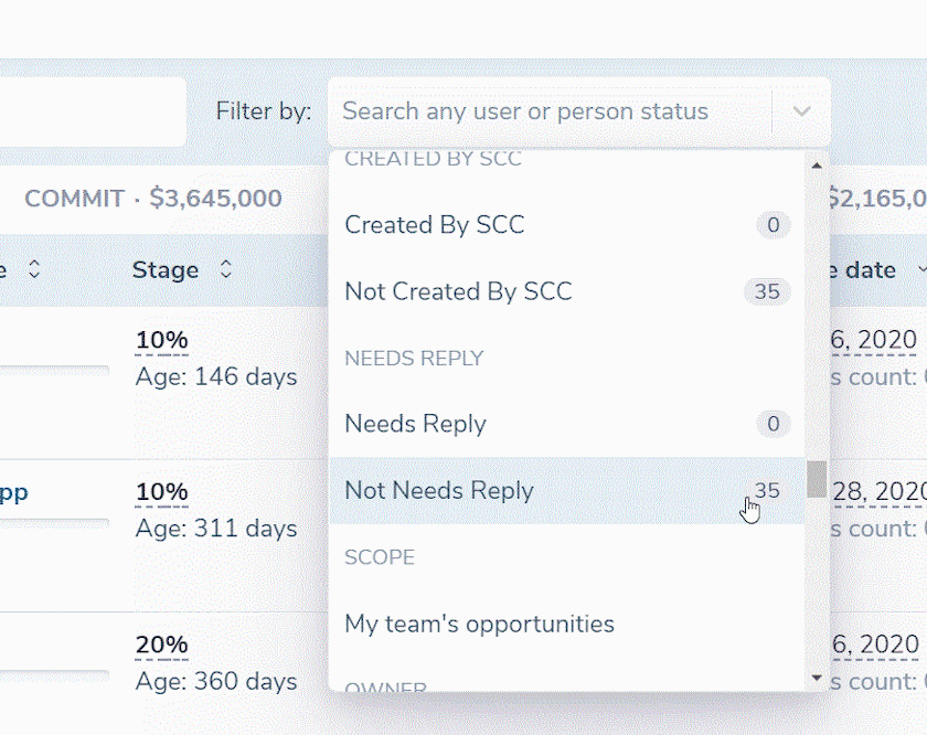 You can filter down the deals by a number of criteria, like Close date, Create date, Age of Opportunities, Owner, etc.
Basically, you can filter by any Salesforce field on an Opportunity object, including your custom fields.
You can also filter by unique criteria, such as Opportunities that haven’t had in/outbound emails, nor meetings for the recent period.
What you see on this chart
The Forecast Trends chart consists of two parts:
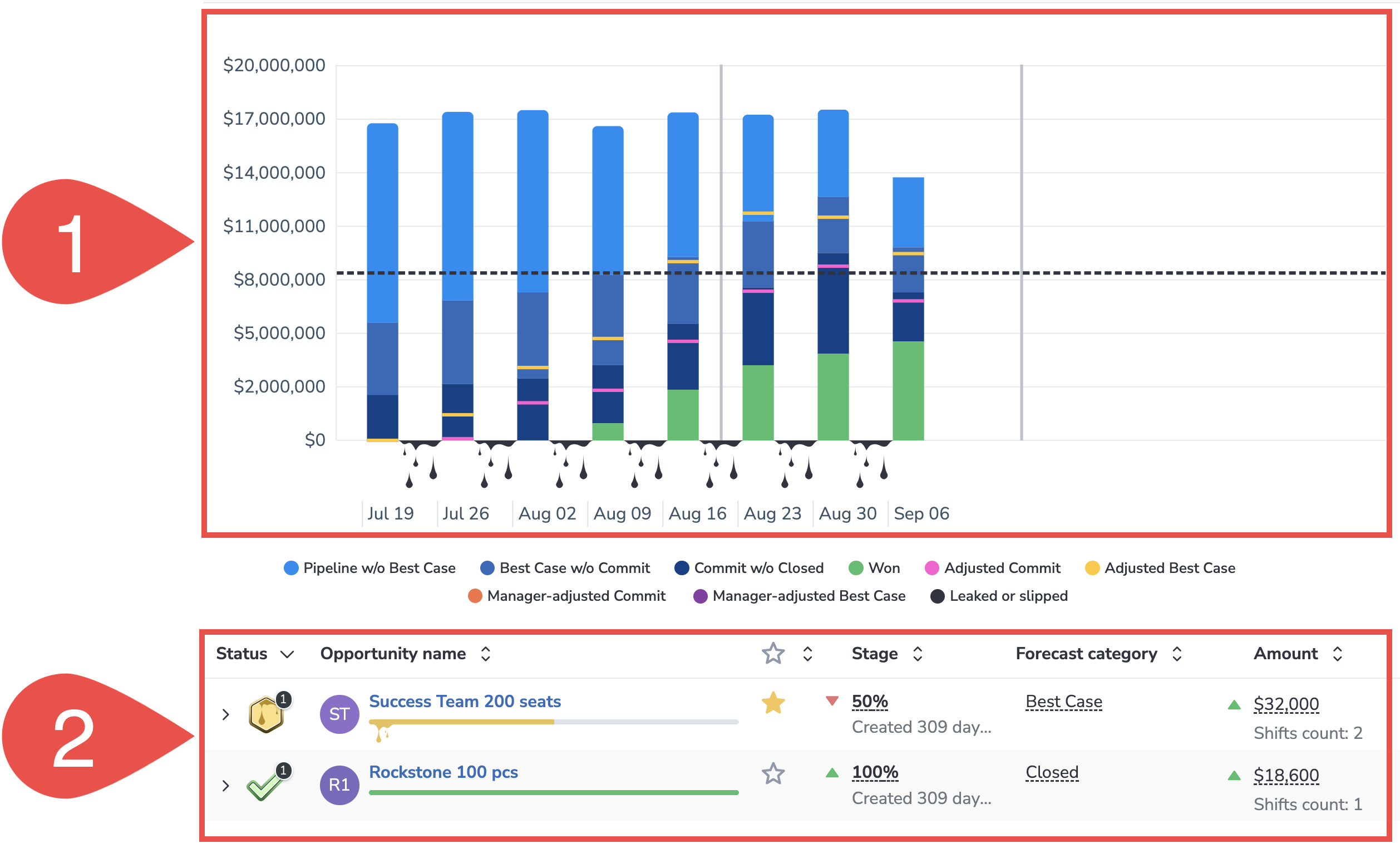
1. Visualization chart of how the deals progressed over the selected period
2. The list of Opportunities composing color blocks in columns
Review deals in each category

Click on any color in the Forecast Trends table to see the Opportunities that comprise the corresponding figure in the chart. The Opportunities appear in the section below.
Build a Focused Pipeline Evolution for a period
If you see an abnormal occurrence (for example, a rapid losing of multiple Opps or vice versa their successful transfer to closed) in Forecast Trends, you can review the Pipeline Evolution chart built based on the period in question.
To generate a Focused Pipeline Evolution report:
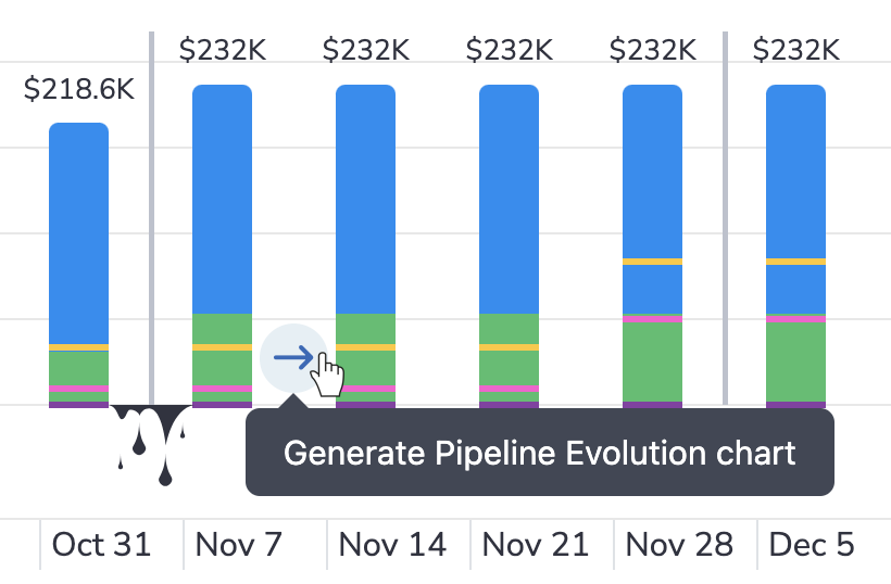
1. Hover over the empty area between two chart columns
2. Click on the arrow that appears
3. The Focused Pipeline Evolution report for the period covered by these two columns will open in a new tab
Tip
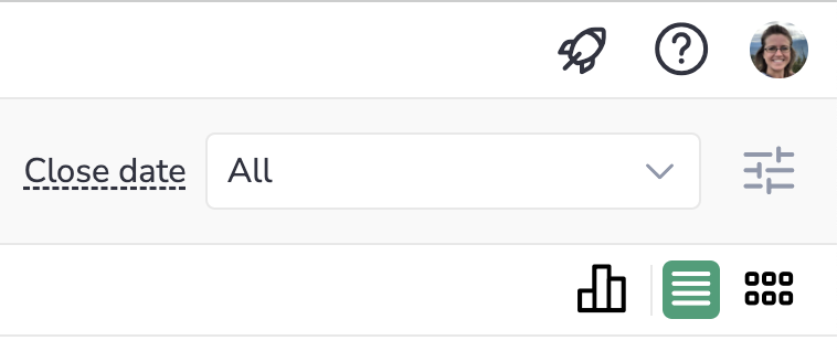
If you need to save the generated Focused Pipeline Evolution for future reference, click on the ![]() download icon in the upper right-hand side of the page.
download icon in the upper right-hand side of the page.
Compare two fiscal periods
See how the current/previous/next quarter compares to the previous quarters.
To enable the compare view:
- Click on the Compare toggle in the upper right corner
- Select the comparison start and end date from the corresponding Close Date drop-down lists.
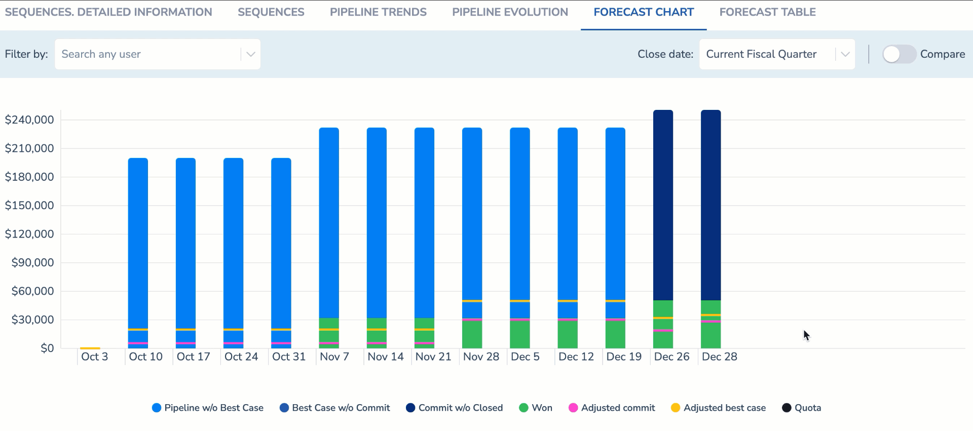
The chart shows week by week comparison, i.e., the first week of the previous quarter and the first week of the current fiscal quarter and so on.
In this way, the managers can compare the situations over different sales periods to identify any similarities and detect any tendencies in revenue leakage.