Integrating Lightning Components in the Email Sidebar


 If your company uses specific Lightning web, Aura components, or flows, you can enable end-users to access and work with them in RG Email Sidebar.
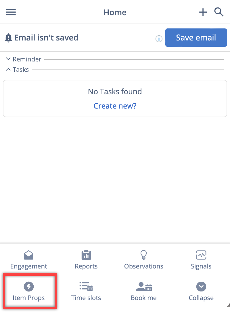
If using Lightning Components in RG Email Sidebar is enabled, the added components appear in the Smart Actions bottom toolbar in the Outlook Add-In/Chrome Extension.
When opened, Lightning Components are rendered in the Sidebar’s interface and users can work with such components as they would in Salesforce.
Revenue Grid can auto-populate some fields for Email and Event objects in the Lightning components rendered in the Sidebar:
|
For an Email |
For an Event |
|---|---|
|
|
Salesforce flow rendering
To be displayed in the Sidebar, Salesforce flows must be rendered as either an Aura Component or a Lightning Web Component. To do this, follow these steps:
-
Specify which flow to render with the
nameattribute. If it’s appropriate for your flow, initialize the flow’s input variables with theinputVariablesattribute.This example renders the Survey Customers flow (from the Create a Satisfaction Survey Trailhead project).
<aura:component> <aura:handler name="init" value="{!this}" action="{!c.init}"/> <lightning:flow aura:id="flowData"/> </aura:component> -
In your client-side controller, identify which flow to start.
({
init : function (cmp) {
   var flow = cmp.find("flowData");
   flow.startFlow("Survey_customers");
}
})
Prerequisites for feature enabling
To enable Revenue grid to access the Lightning components, you must amend the custom Lightning component’s configuration as described in this Salesforce article or following the instructions provided below.
1. Make the component available for Outlook and Gmail
In the component’s configuration file, add the lightning__Inbox target and set \<isExposed> to true.
Config example:
<?xml version="1.0" encoding="UTF-8"?>
<LightningComponentBundle xmlns="http://soap.sforce.com/2006/04/metadata">
    <isExposed>true</isExposed>
    <apiVersion>46.0</apiVersion>
    <targets>
        <target>lightning__Inbox</target>
    </targets>
    <description>Sample Email Application Pane</description>
</LightningComponentBundle>
2. Add properties to the component
The lightning__Inbox target you’ve added in the previous step enables you to specify the component’s properties.
In the component’s JavaScript file, specify the properties for the component. The available properties are dates, emails, location, messageBody, mode, people, source, subject. See the next article section for more info about each property.
Config example:
// sampleEmailAppPane.js

import { LightningElement, api } from "lwc";

export default class SampleEmailAppPane extends LightningElement {
  @api messageBody;
  @api subject;
  @api people;
}
Available properties
dates
Data Type: Object
The event’s date.
dates: {
  start: 'value',
  end: 'value'
}
emails
Data Type: Array
The email addresses of the recipients in a simple array. Use this property if it doen’t matter whether the email address is in the To, From, or CC field, or what kind of an attendee the addressee is.
Supported Source: email, eventlocation
Data Type: String
The location of the event.
Supported Source: event
messageBody
Data Type: String
The message body of the email in plain text. HTML formatting isn’t preserved. Supported Source: email, event
mode
Data Type: String
The access mode. Possible values: ‘view’, ‘edit’
Supported Source: email, event
people
Data Type: Object
The recipients’ email addresses on the current email or event. The shape of the people attribute changes according to the value of the source attribute. When the source attribute is set to email, the people object contains these elements.
{
  to: [
    {
      name: 'name',
      email: 'email'
    }
  ],
  cc: [
    {
      name: 'name',
      email: 'email'
    }
  ],
  from: [
    {
      name: 'senderName',
      email: 'senderEmail'
    }
  ]
}
When the source attribute is set to event, the people object contains these elements.
{
  requiredAttendees: [
    {
      name: 'attendeeName',
      email: 'email'
    }
  ],
  optionalAttendees: [
    {
      name: 'optAttendeeName',
      email: 'email'
    }
  ],
  organizer: [
    {
      name: 'organizerName',
      email: 'senderEmail'
    }
  ]
}
source
Data Type: String
Possible values: ‘email’, ‘event’
Supported Source: email, event
subject
Data Type: String
The subject of the email.
Supported Source: email, event
resolvedObjects
Data Type: String
The IDs the objects resolved by the Sidebar for an email/calendar item and the source of the related objects (to, from, CC, BCC)
resolvedObjects: [
  {
    id: 'objectId',
    source: 'value'
  }
]
internetMessageId
Data Type: String
Unique ID of an email.
Supported Source: email
iCalUId
Data Type: String
Unique ID of an event.
Supported Source: event
3. Make the component’s width adaptable
To ensure that the component is correctly displayed in the Add-In, make its width adaptable.
To do this, follow the instructions in this Salesforce article or provided below.
In the JavaScript class of your component, apply the @api decorator to establish a public property named flexipageRegionWidth. This property is designed to capture the width of the region within which the component is displayed on the page.
// testClass.js
import { LightningElement, api } from "lwc";

export default class TestClass extends LightningElement {
  @api flexipageRegionWidth;
}
Incorporate this flexipageRegionWidth property within the component’s HTML template. The component will automatically rerender whenever there’s a change in the value of flexipageRegionWidth.
<!-- testClass.html -->
<template>
  <div class={flexipageRegionWidth}>...</div>
</template>
Utilize CSS for specifying how the component should behave in response to varying region widths. The valid CSS class values to use are SMALL, MEDIUM, and LARGE.
4. Create a special Lightning dependency app
To enable Revenue Grid to deploy your component within the RG Email Sidebar, you must create a special Lightning dependency app. It will describe the component dependencies of a Lightning components app when it’s initialized using Lightning Out. Learn more about
To create a Lightning dependency app:
-
Click the Gear icon.
-
Select Developer console.
-
In Developer console, click File > New > Lightning Application.
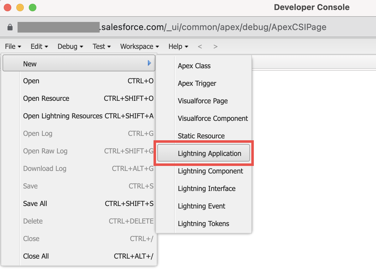
-
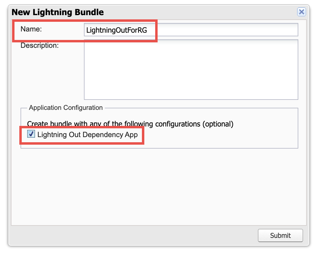
Enter the name of the app. It must include no spaces or special characters. Save the app name in a text editor. Later you’ll need to share it with our team.
-
Select the Lightning Out Dependency App checkbox.
-
Click Submit.
-
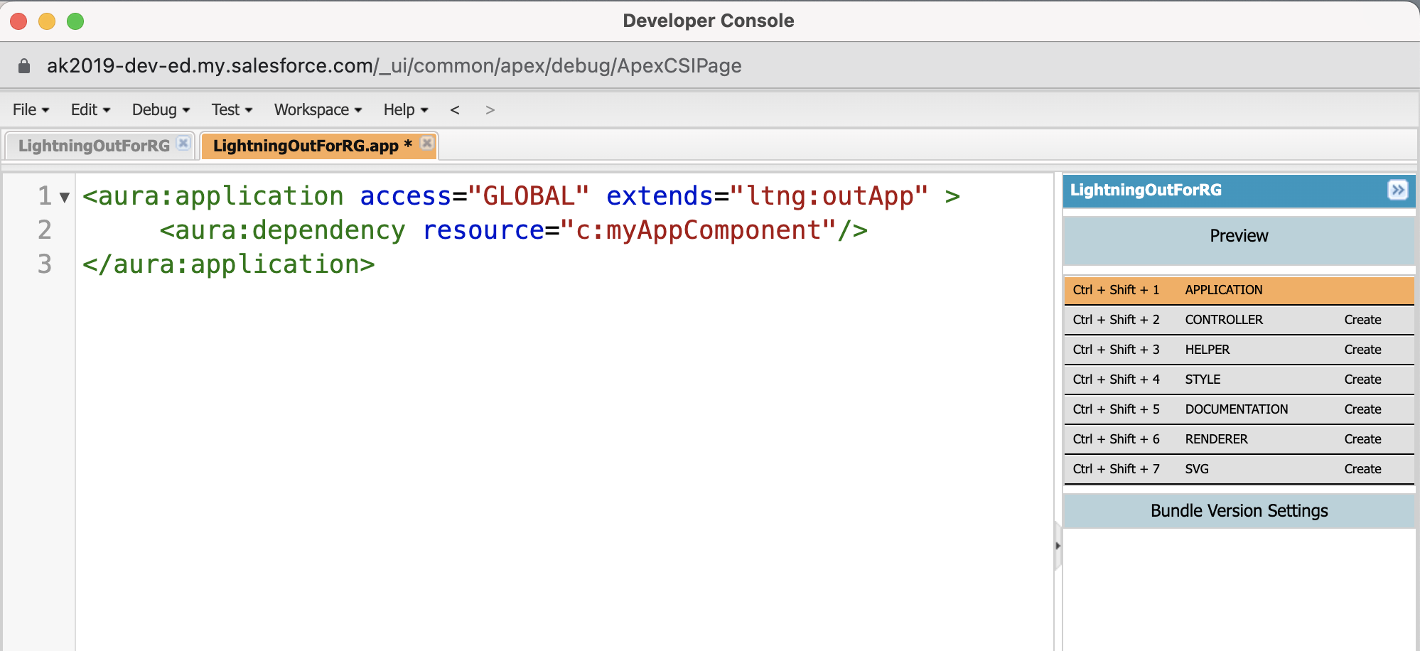
In the code editor:
- Set access control by adding access=”GLOBAL” to the <aura:application> tag.
- Add <aura:dependency resource=”c:myAppComponent”/> within <aura:application>. Substitute c:myAppComponent with the name of the necessary custom component.
-
Press Ctrl + S to save the changes.
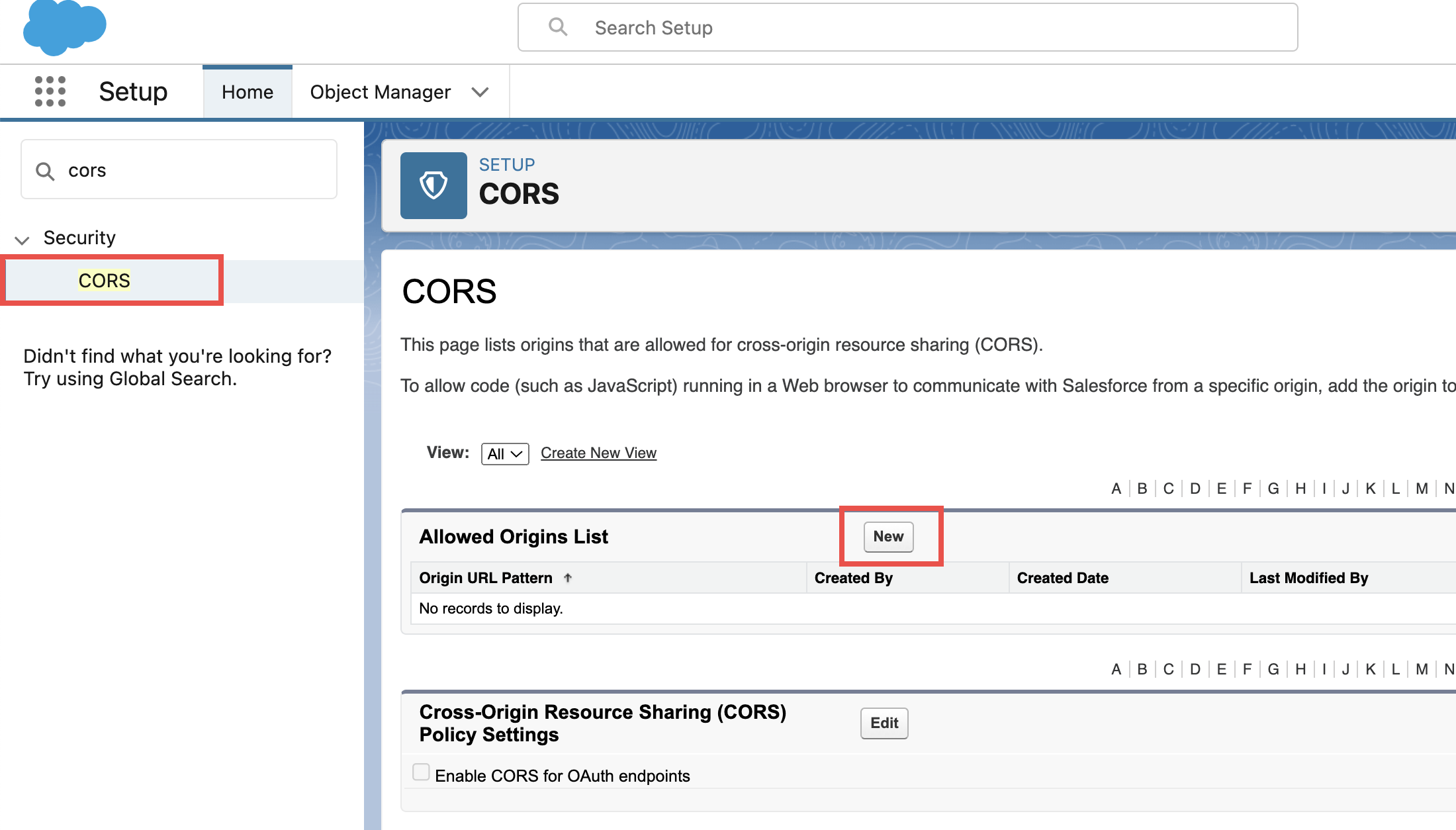
5. Create a new CORS
To enable Revenue Grid to send requests to your Lightning component, you must add Revenue Grid to the Cross-Origin Resource Sharing (CORS) allowlist.
To do this:
- In Salesforce Lightning, click the Gear icon.
- Select Setup.
- In the Quick Search field, enter CORS and open the corresponding page.
-
Click New.
-
In the Origin URL Pattern field, enter the value of your Revenue Grid tenant URL. To obtain your Revenue Grid tenant URL, follow the steps in this article.
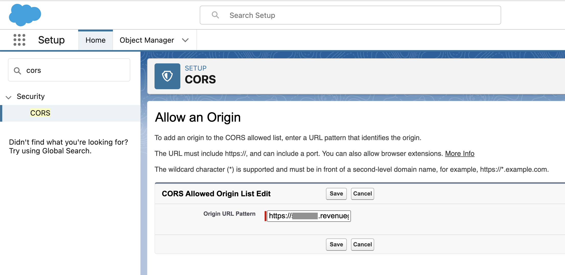
-
Click Save to enforce the changes.
Feature enabling
Important
This is an on-demand feature. To enable the feature, submit a corresponding request to our Support Team.
This functionality is managed with the admin-level setting SalesforceAddinLightningOutComponents. The setting is intended for adding JSON values specifying the following parameters for each component:
- ID
- Label, i.e., the name of the component that will be displayed in the Sidebar’s Smart Actions menu. It must contain no more than one or two words
- Icon, we add a default icon for all components
- AppName
- AppComponentName
After saving the SalesforceAddinLightningOutComponents setting, the necessary components will appear in the bottom toolbar in the Sidebar.
Note
Even though the LWC appear in the Smart Actions toolbar in the Sidebar, they are not displayed on the Customization page in the Smart Actions section for end users.
To enable the feature, provide the following info:
- Title: the name of the component users will see in the Sidebar’s bottom toolbar
- Icon: the URL for the icon that will be displayed in the Sidebar. If not provided, a default icon will be used
- appName: the name of the Lightning dependency app you created in step 4. The app name must follow this format: “c:myAppName”
- componentName: the component name must follow this format: “c:myAppComponent”
Considerations for using Lightning Components on MacOS
It’s necessary to enable using a session token instead of a cookie for Lightning apps on third-party sites in Salesforce to ensure the proper functioning of LWS in RG Email Sidebar used in the Safari browser or on MacOS.
To do that:
-
Click on the Gear icon and select Setup.
-
In the Quick Search field, enter Session Settings to quickly find and open the necessary setting.
-
On the page that opens, enable the When embedding a Lightning application in a third-party site, use a session token instead of a session cookie checkbox in the Session Settings section.
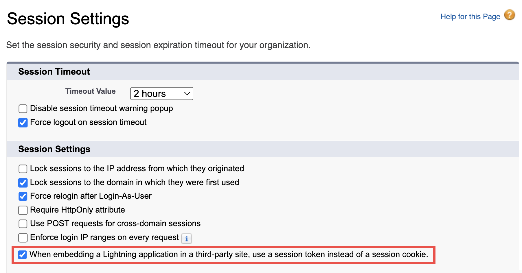
-
Click Save to preserve the changes.
If the mentioned setting is not enabled, the LWC in RG Email Sidebar opened in the Safari browser, or Outlook for MacOS will not open with the following error:
Failed to load lightning component within timeout. Please check its configuration.
This issue is related to the “Prevent cross-site tracking” policy in Safari and Mac OS. Learn more in this Microsoft help article.